Inaccurate Virus Models Are Panicking Officials Into Ill-Advised Lockdowns
As U.S. state and local officials halt the economy and quarantine their communities over the Wuhan virus crisis, one would hope our leaders were making such major decisions based on well-sourced data and statistical analysis. That is not the case.
A scan of statements made by media, state governors, local leaders, county judges, and more show many relying on the same source, an online mapping tool called COVID Act Now. The website says it is “built to enable political leaders to quickly make decisions in their Coronavirus response informed by best available data and modeling.”
An interactive map provides users a catastrophic forecast for each state, should they wait to implement COVID Act Now’s suggested strict measures to “flatten the curve.” But a closer look at how many of COVID Act Now’s predictions have already fallen short, and how they became a ubiquitous resource across the country overnight, suggests something more sinister.
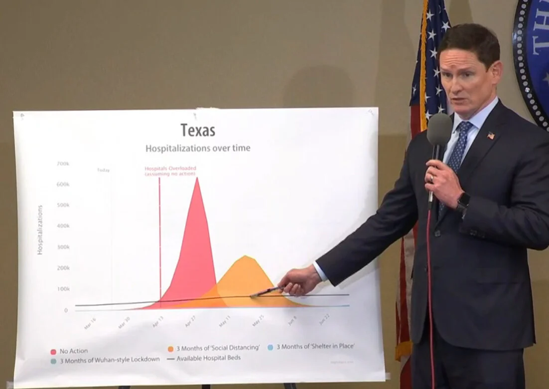
When Dallas County Judge Clay Jenkins announced a shelter-in-place order on Dallas County Sunday, he displayed COVID Act Now graphs with predictive outcomes after three months if certain drastic measures are taken. The NBC Dallas affiliate also embedded the COVID Act Now models in their story on the mandate.
The headline of an NBC Oregon affiliate featured COVID Act Now data, and a headline blaring, “Coronavirus model sees Oregon hospitals overwhelmed by mid-April.” Both The Oregonian and The East Oregonian also published stories featuring the widely shared data predicting a “point of no return.”
Michigan Gov. Gretchen Whitmer cited COVID Act Now when telling her state they would exceed 7 million cases in Michigan, with 1 million hospitalized and 460,000 deaths if the state did nothing.
A local CBS report in Georgia featured an Emory University professor urging Gov. Brian Kemp with the same “point of no return” language and COVID Act Now models.
The models are being shared across social media, news reports, and finding their way into officials’ daily decisions, which is concerning because COVID Act Now’s predictions have already been proven to be wildly wrong.
COVID Act Now predicted that by March 19 the state of Tennessee could expect 190 hospitalizations of patients with confirmed Wuhan virus. By March 19, they only had 15 patients hospitalized.
In New York, Covid Act Now claimed nearly 5,400 New Yorkers would’ve been hospitalized by March 19. The actual number of hospitalizations is around 750. The site also claimed nearly 13,000 New York hospitalizations by March 23. The actual number was around 2,500.
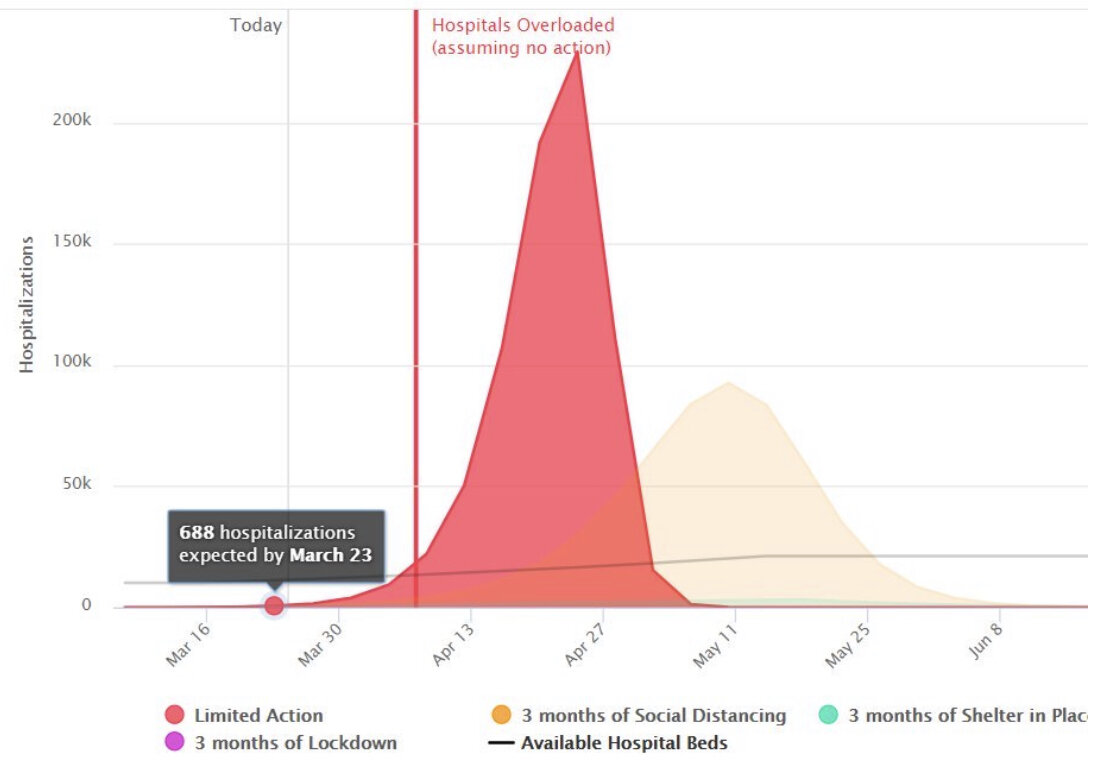
In Georgia, COVID Act Now predicted 688 hospitalizations by March 23. By that date, they had around 800 confirmed cases in the whole state, and fewer than 300 hospitalized.
In Florida, Covid Act Now predicted that by March 19, the state would face 400 hospitalizations. On March 19, Gov. Ron DeSantis said 90 people in Florida had been hospitalized.
COVID Act Now’s models in other states, including Oklahoma and Virginia, were also far off in their predictions. Jordan Schachtel, a national security writer, said COVID Act Now’s modeling comes from one team based at Imperial College London that is not only highly scrutinized, but has a track record of bad predictions.
Jessica Hamzelou at New Scientist notes the systematic errors researchers and scientists have found with the modeling COVID Act Now relies on:
Chen Shen at the New England Complex Systems Institute, a research group in Cambridge, Massachusetts, and his colleagues argue that the Imperial team’s model is flawed, and contains ‘incorrect assumptions’. They point out that the Imperial team’s model doesn’t account for the availability of tests, or the possibility of ‘super-spreader events’ at gatherings, and has other issues.
Among other issues, COVID Act Now lists the “Known Limitations” of their model. Here are a few that seem especially alarming, considering they generate a model for each individual state:
Many of the inputs into this model (hospitalization rate, hospitalization rate) are based on early estimates that are likely to be wrong.
Demographics, populations, and hospital bed counts are outdated. Demographics for the USA as a whole are used, rather than specific to each state.
The model does not adjust for the population density, culturally-determined interaction frequency and closeness, humidity, temperature, etc in calculating R0.
This is not a node-based analysis, and thus assumes everyone spreads the disease at the same rate. In practice, there are some folks who are ‘super-spreaders,’ and others who are almost isolated.
So why is the organization or seemingly innocent online mapping tool using inaccurate algorithms to scaremonger leaders into tanking the economy? Politics, of course.
Founders of the site include Democratic Rep. Jonathan Kreiss-Tomkins and three Silicon Valley tech workers and Democratic activists — Zachary Rosen, Max Henderson, and Igor Kofman — who are all also donors to various Democratic campaigns and political organizations since 2016. Henderson and Kofman donated to the Hillary Clinton campaign in 2016, while Rosen donated to the Democratic National Committee, recently resigned Democratic Rep. Katie Hill, and other Democratic candidates. Prior to building the COVID Act Now website, Kofman created an online game designed to raise $1 million for the eventual 2020 Democratic candidate and defeat President Trump. The game’s website is now defunct.
Perhaps the goal of COVID Act Now was never to provide accurate information, but to scare citizens and government officials into to implementing rash and draconian measures. The creators even admit as much with the caveat that “this model is designed to drive fast action, not predict the future.”
They generated this model under the guise of protecting communities from overrun hospitals, a trend that is not on track to happen as they predicted. Not only is the data false, and looking more incorrect with each passing day, but the website is optimized for a disinformation campaign.
A social media share button prompts users to share their models and alarming graphs on Facebook and Twitter with the auto-fill text, “This is the point of no return for intervention to prevent X’s hospital system from being overloaded by Coronavirus.”


